

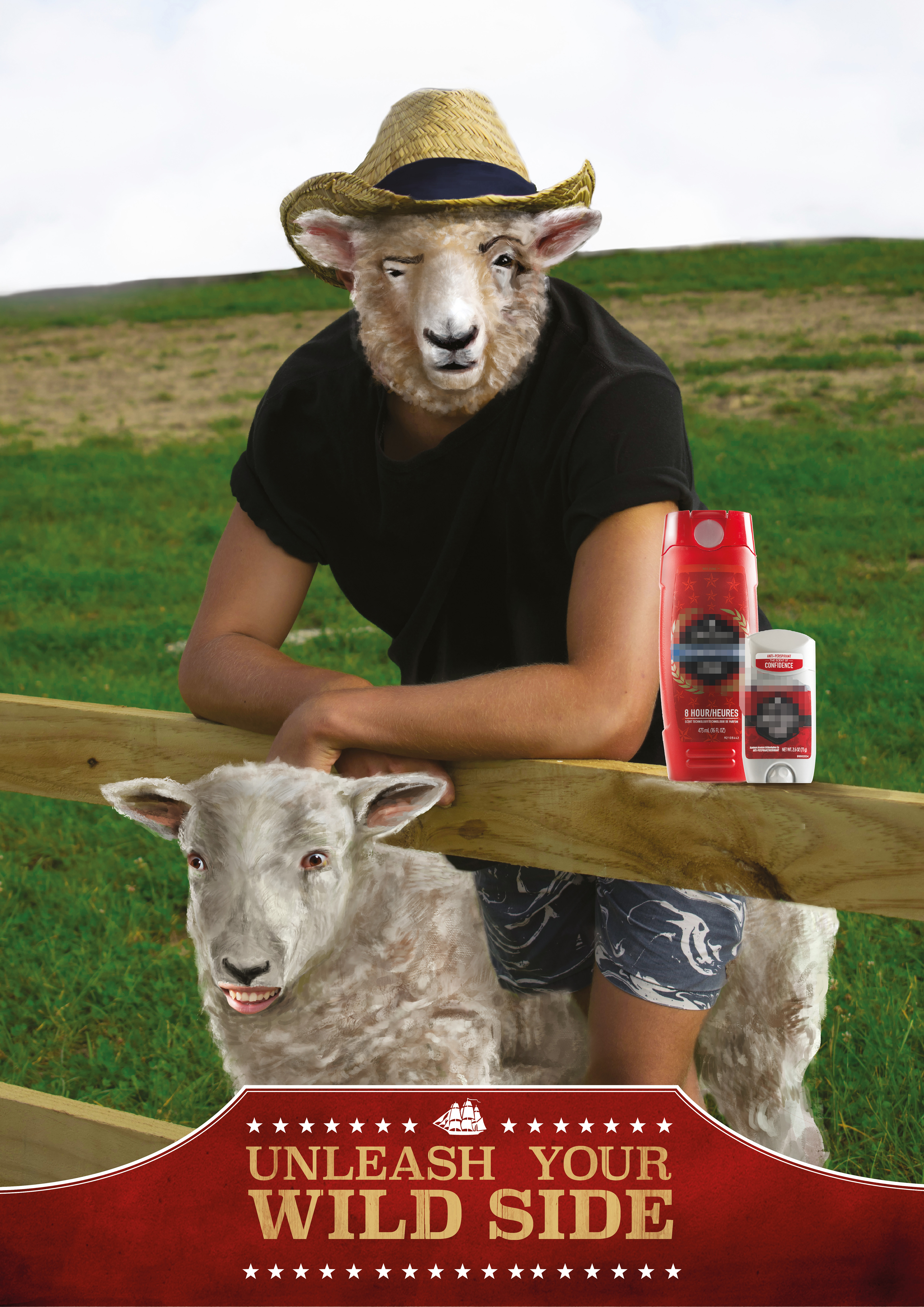
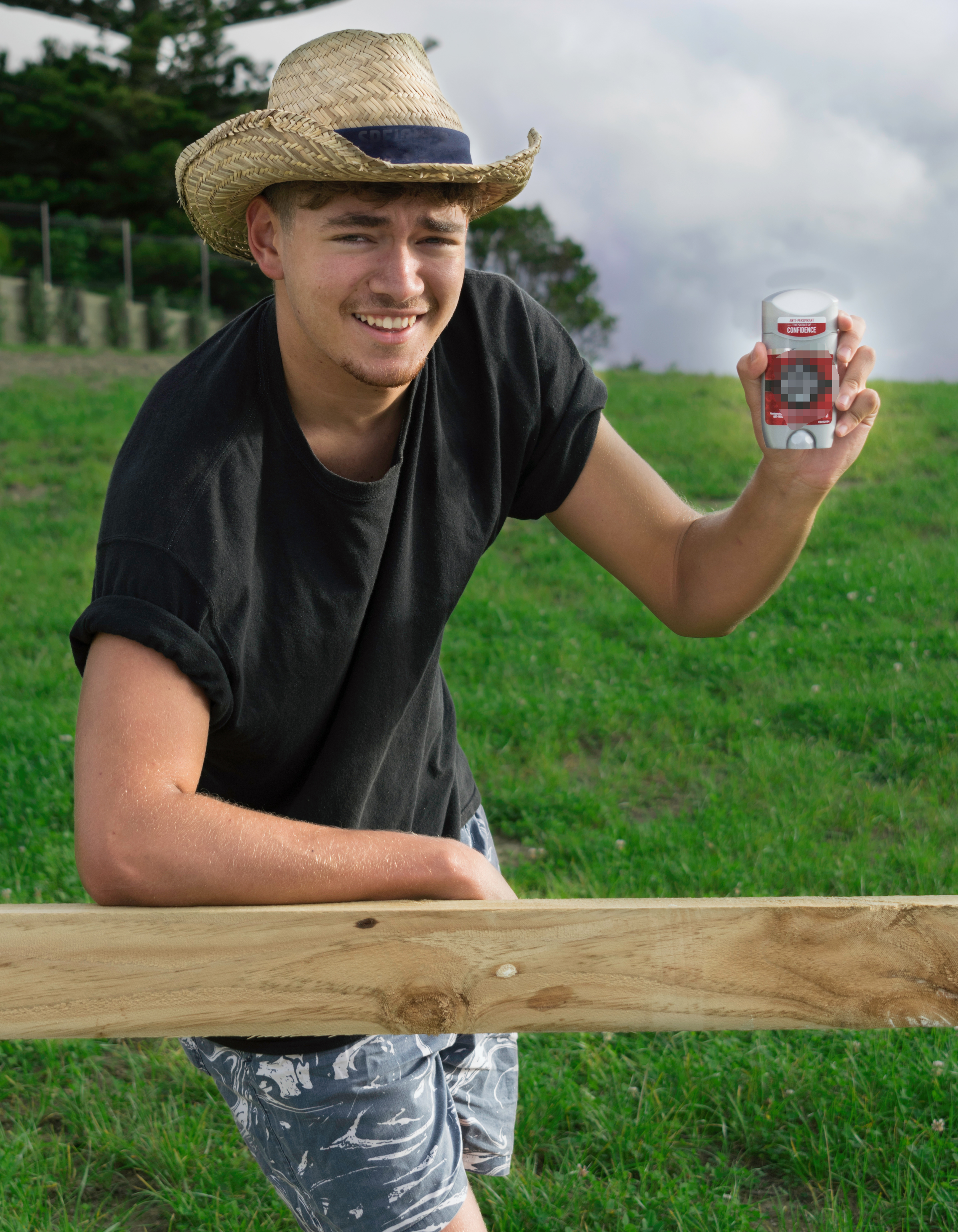
The brand in these posters is Old Spice, the commodity is men’s fragrance. Old Spice can be seen as a lower end fragrance brand. Their target market ranges from 12-34 year old males and they market heavily through social media and T.V advertisements. Their humorous style is recognizable globally but they didn’t find as much success in NZ. For these posters, the goal was to create a set that would resonate with Kiwi’s more than anything that exists with Old Spice. This is probably the loudest poster of the three but it retains Old Spice’s mantra while creating an image where New Zealanders can understand. The logos have been removed from their original positions and blurred where necessary to avoid issues with copyright.
CASE STUDY
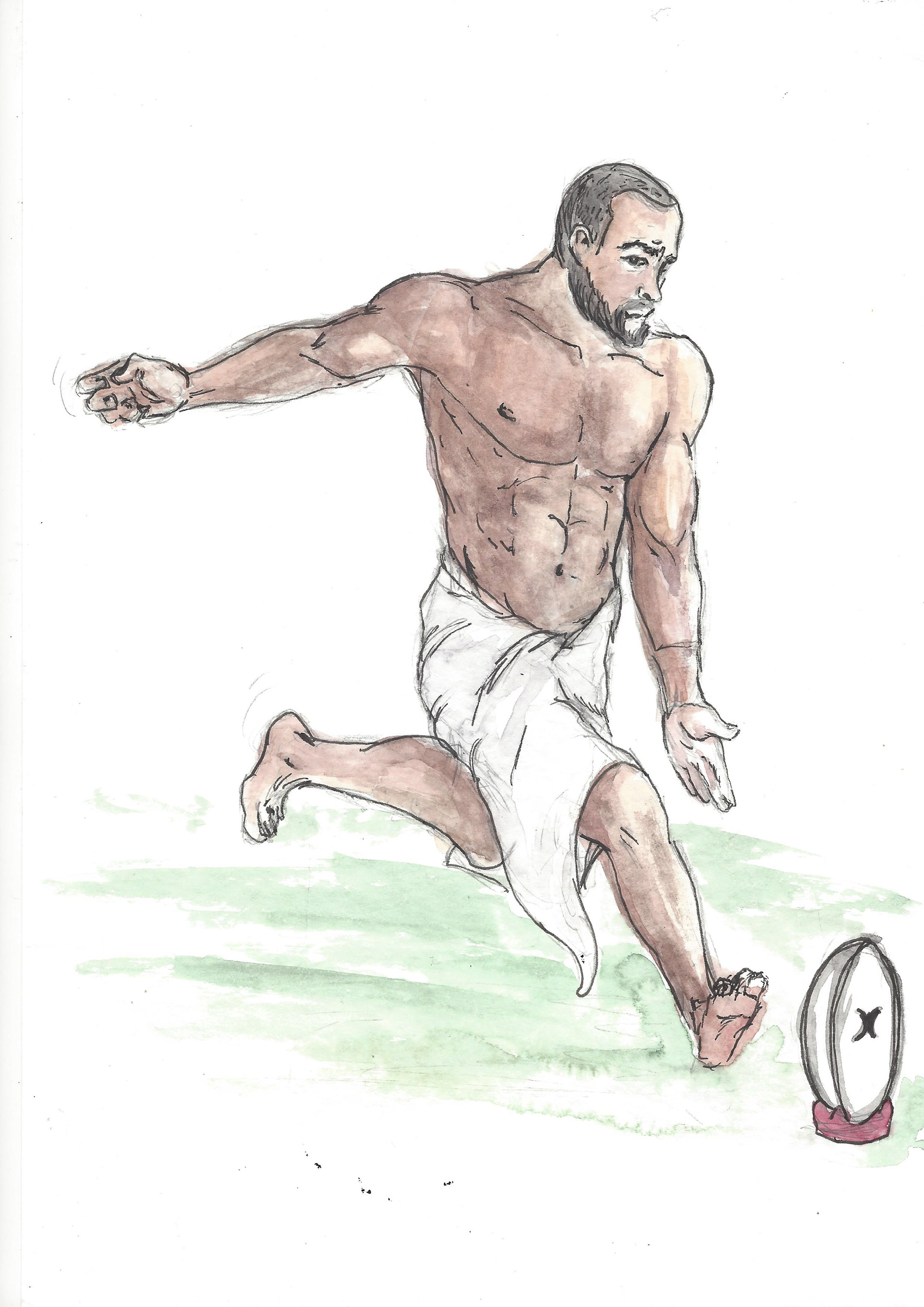

The project began with identifying Kiwi myths and seeing what would best translate to an Old Spice context. Nature, rugby and sheep jokes seemed to be the best fit; quick illustrations were done to respond to these ideas. After thorough research into their existing material, they generally have over the top advertisements with humour and the idea of being a man as the focus.
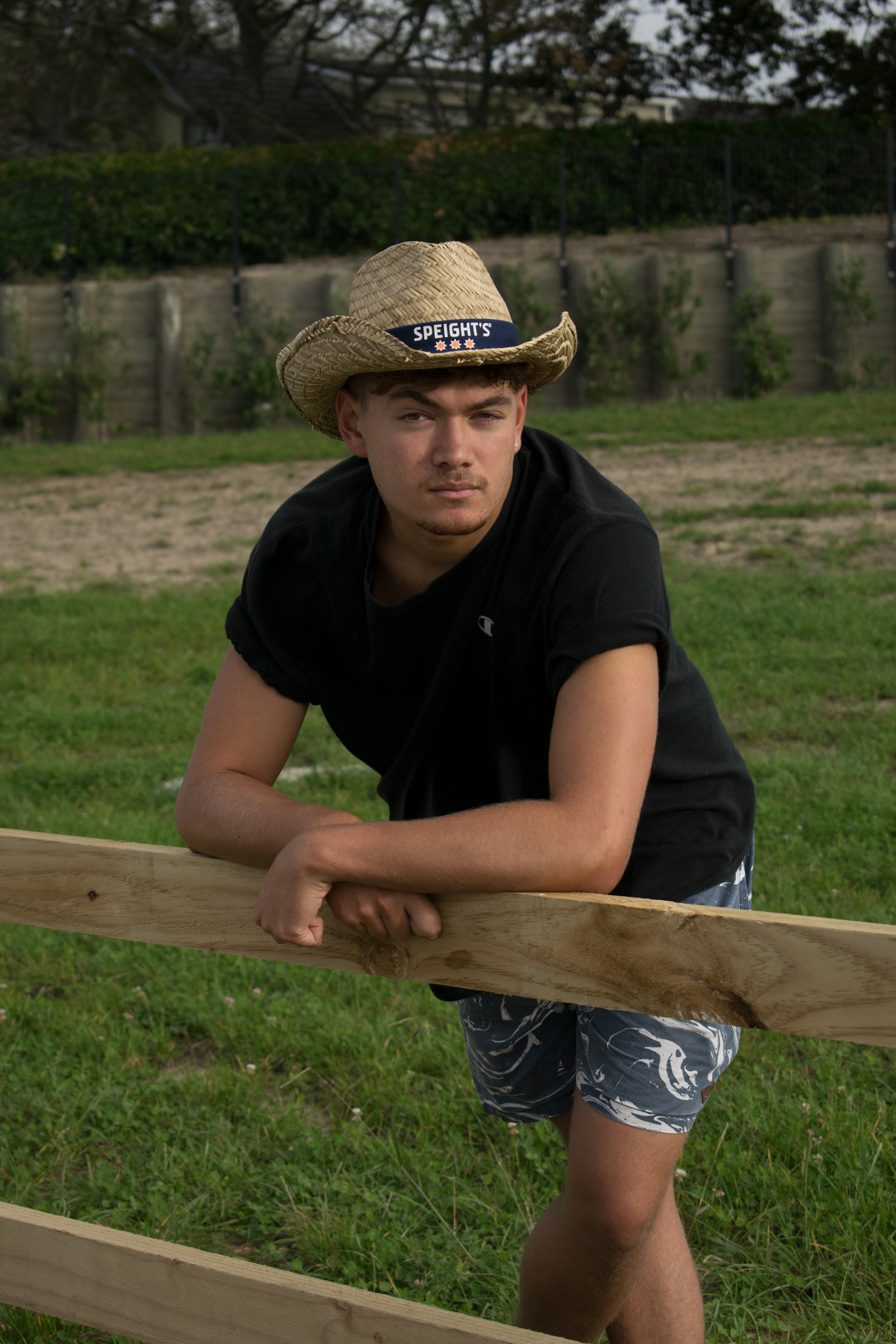
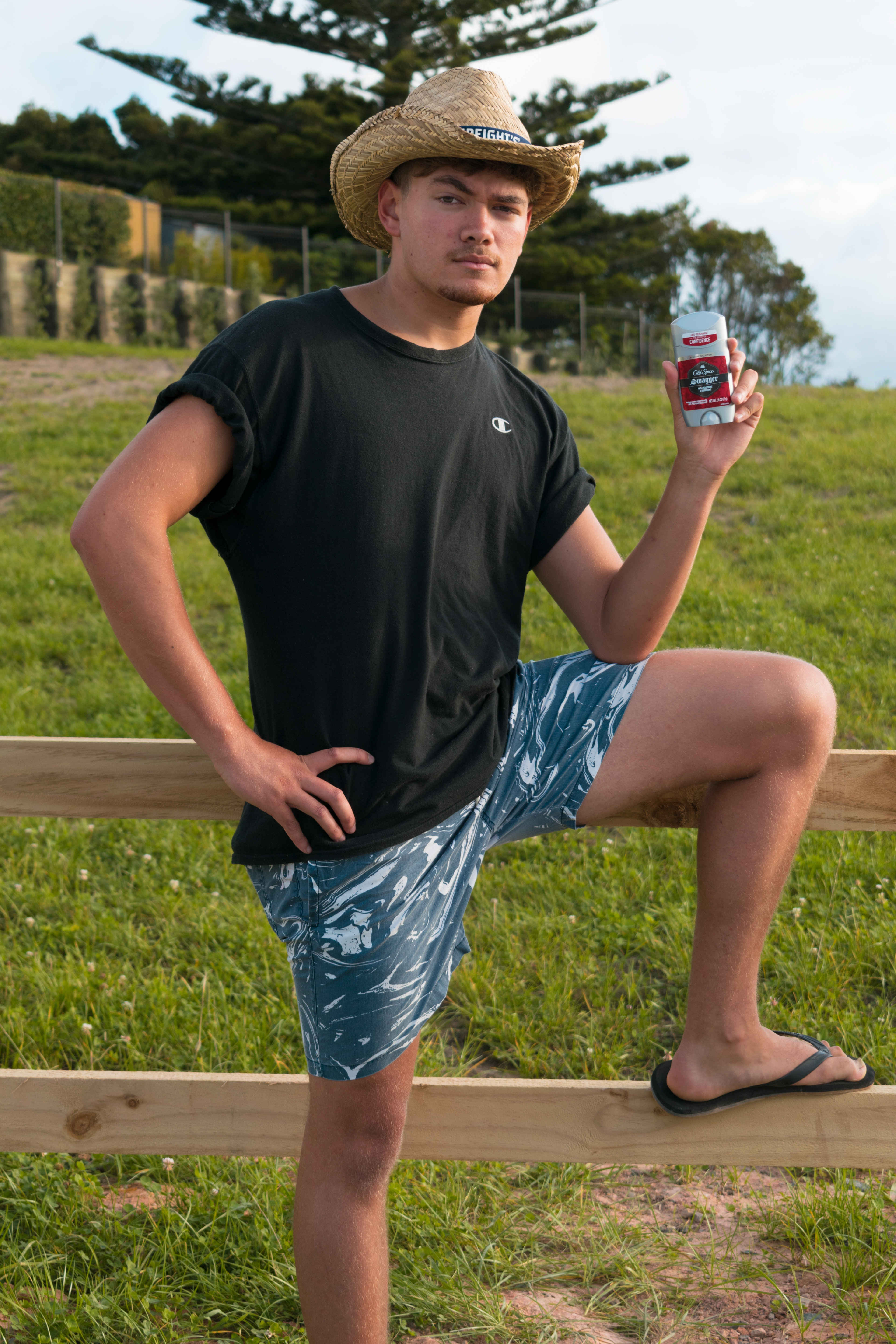
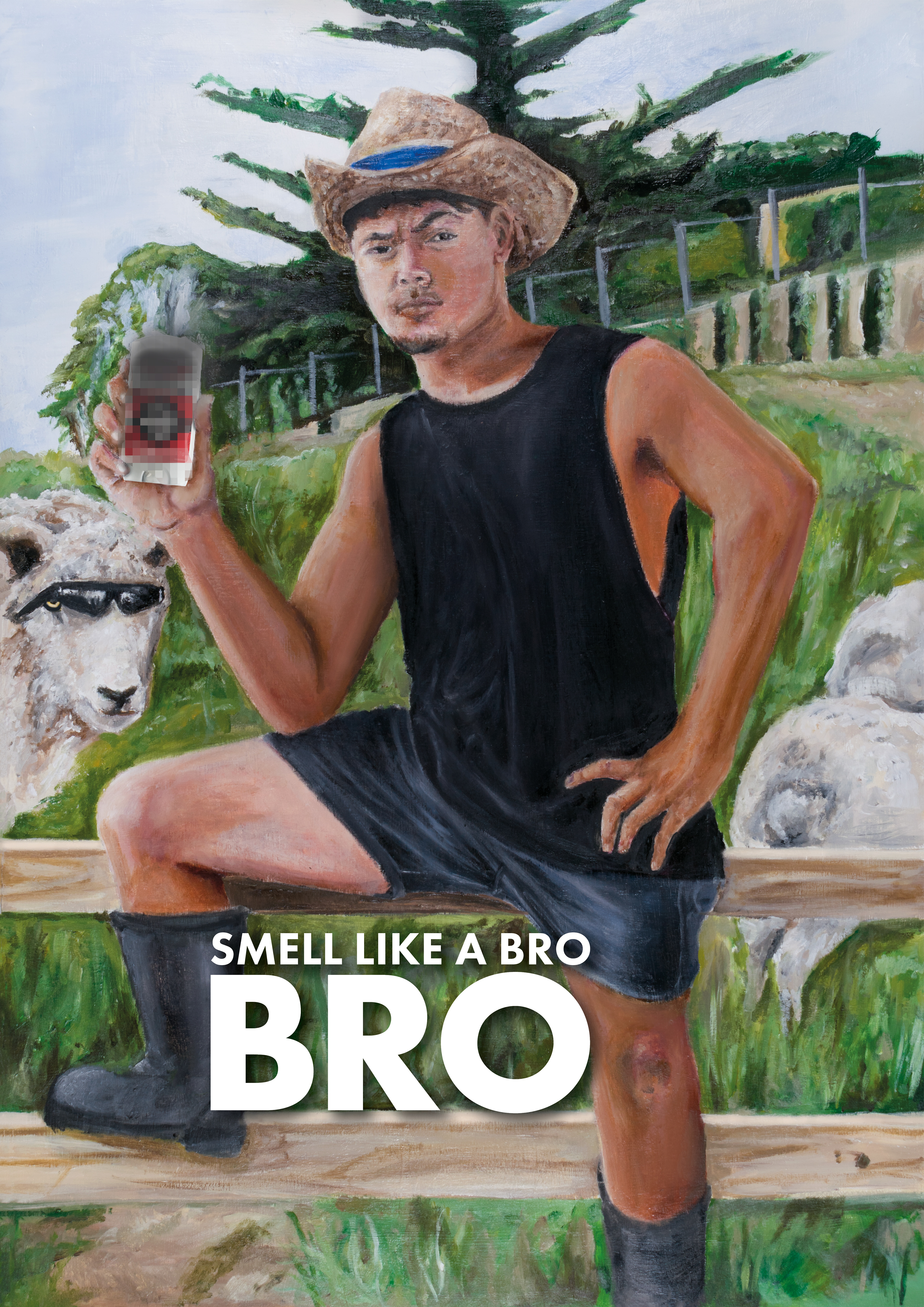
The farmer look was explored as well because of the prominence of agriculture in New Zealand. An iconic archetype for the kiwi male would be someone wearing a stubbies, gumboots and maybe a tank top and straw hat. With that in mind, photos were taken on location to emulate this feel (attire was as close as possible but is addressed in the painting)
In early stages of development, I played with colour vibrancy especially with the green to emulate a flat, collage like feel that existing Old Spice material incorporates. Upping the exposure of the foreground in relation to the background also emphasized the flat feeling. This was implemented into the final poster seen above.
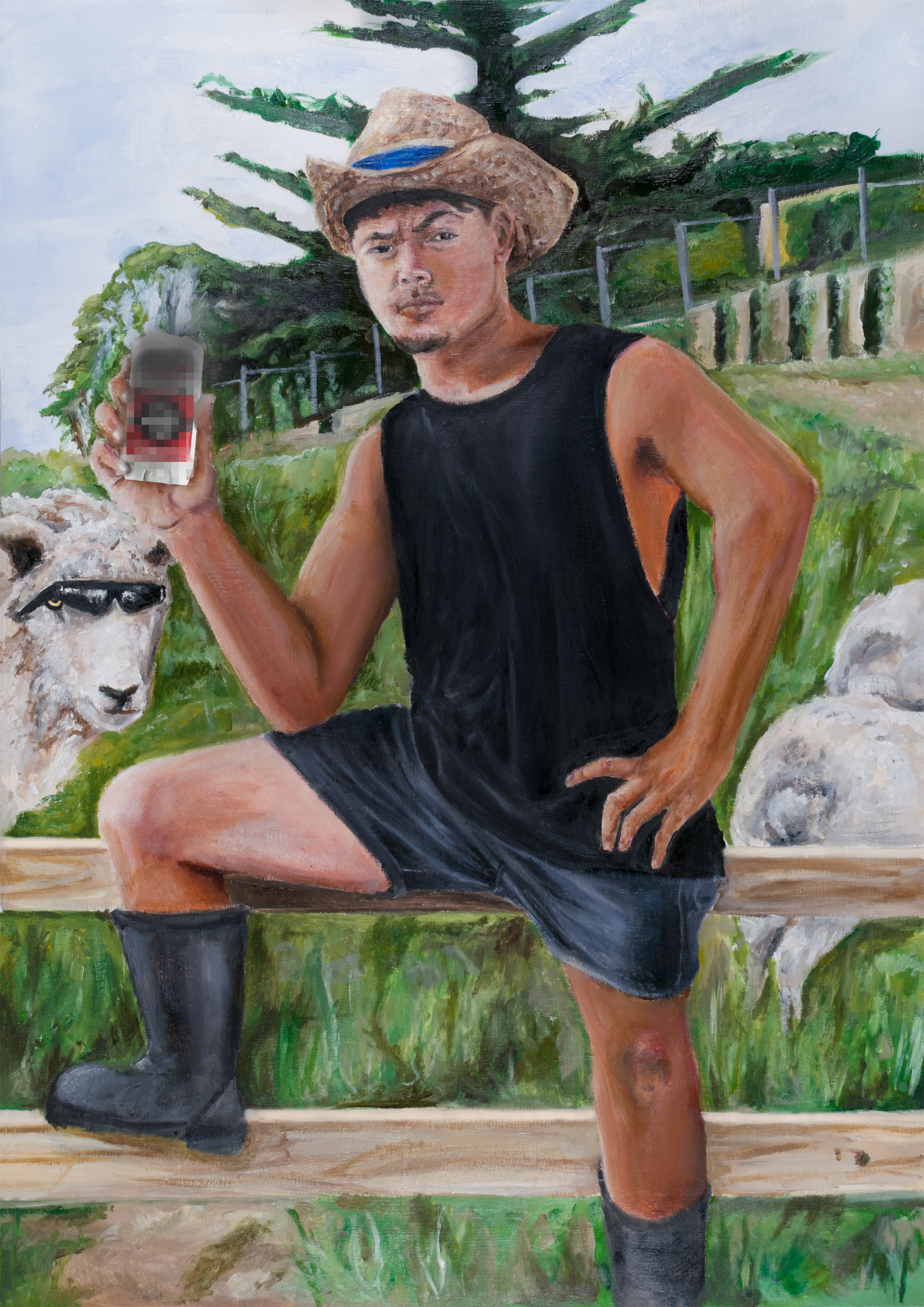
Like the Hugo Boss assignment, I wanted to transfer the influence of renaissance paintings into my work. In this case, pose and composition. I wanted to achieve a sarcastic tone seeing as farmers are Kiwi's are known for their light hearted nature. Mixing that visual theme with the more formal painting approach creates a quirky image. In the background, I added a sheep with "dirty dogs" glasses as it adds a subtle humorous element as well as a link to the the other poster with the interaction of human elements with animalistic.
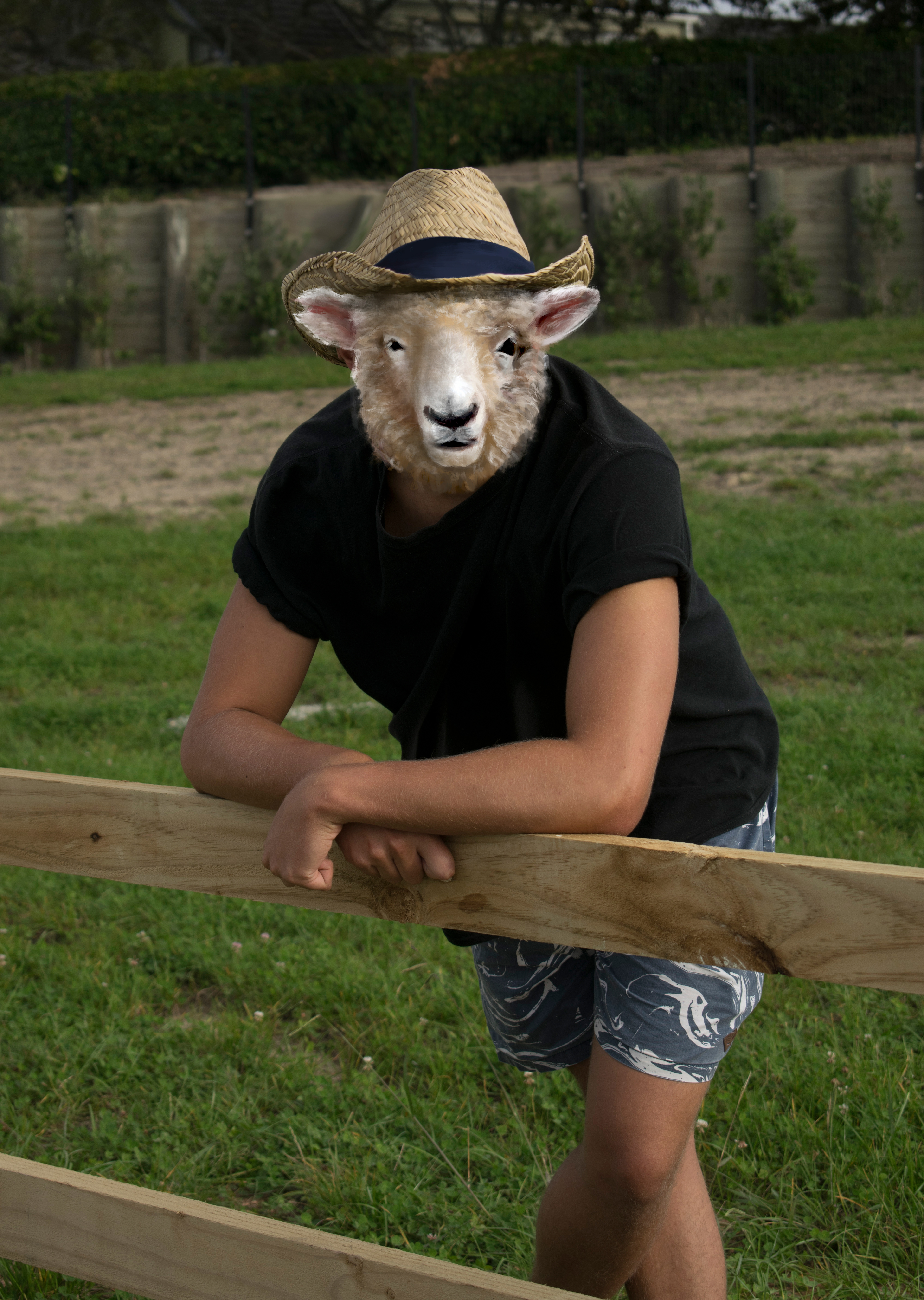

For the combination poster, I opted to continue with the farmer aesthetic but focus on creating a perplexing image rather than a loud advertisement. With inspiration from other photographers, I decided to digitally paint a sheep head onto some existing photos I already had taken. Initially, I painted onto a suit photo because of the contrast between sophistication and but to keep cohesion between the two images, I opted for the farmer look.